
Patient Portal
0—1 PRODUCT | UX/UI DESIGN | MOBILE APP
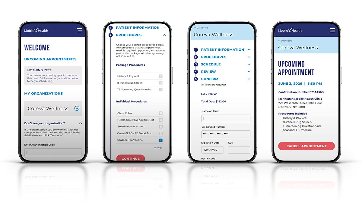
Mobile Health is an occupational healthcare company specializing in pre-employment screening exams. At the center of its patient-facing experience was a self-service portal used by employees to schedule required exams — often as a first step in starting a new job.
The user base was notably diverse: spanning ages 18 to 65+, varying widely in technical literacy, and including a significant proportion of non-native English speakers. This wasn't a typical SaaS product with a defined power user — it was a high-stakes, often unfamiliar experience for people navigating it under time pressure. Accessibility and clarity weren't enhancements; they were the baseline requirement.
Context
The legacy patient portal had accumulated critical usability failures — confusing exam descriptions, language complexity unsuitable for ESL speakers, appointment windows that expired too quickly, and little to no post-booking confirmation. The result was high abandonment rates and frequent scheduling errors. Employer clients were routinely stepping in to complete the process on behalf of their employees, creating friction and undermining confidence in the product.
Despite the clear impact, a portal redesign had not been prioritized on the product roadmap. Recognizing the operational and reputational cost of the experience gap, I made the case directly to executive leadership — presenting the pattern of client complaints, scheduling failures, and downstream support burden as evidence that this was a business-critical issue, not just a UX one. The initiative was subsequently added to the roadmap. As the company's sole UX designer, I owned the design end-to-end, from discovery through delivery.
Problem
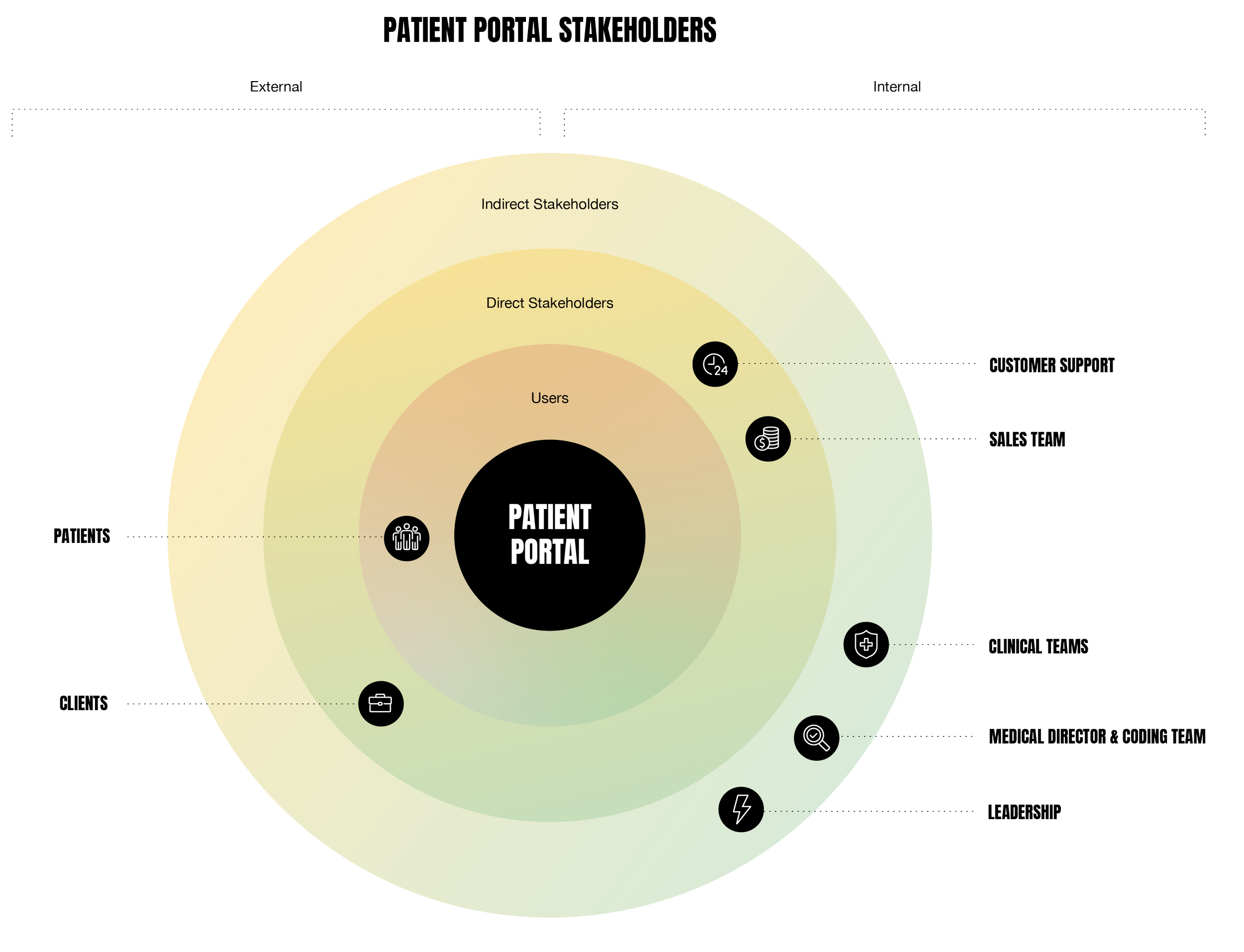
Given the diversity of our user base, accessibility shaped the research approach from the start. Because direct patient interviews were not possible under HIPAA constraints, I compiled insights from multiple sources: site visits across several New York clinics to observe check-in and check-out workflows firsthand, and dozens of individual and group interviews with clinical staff and internal stakeholders who interacted with patients daily.
Aggregated client feedback surfaced four consistent pain points:
Confusing exam package descriptions
Language complexity unsuitable for ESL speakers
Appointment windows that expired too quickly
Lack of post-booking confirmation and follow-up detail
Accessibility considerations were embedded throughout the design process — informing reading level targets, iconography choices, and the structure of confirmation messaging. I developed iterative sketches and wireframes to map revised user flows, incorporating stakeholder feedback at key checkpoints before collaborating with the assigned development team to bring the redesign to launch.
Process
Results
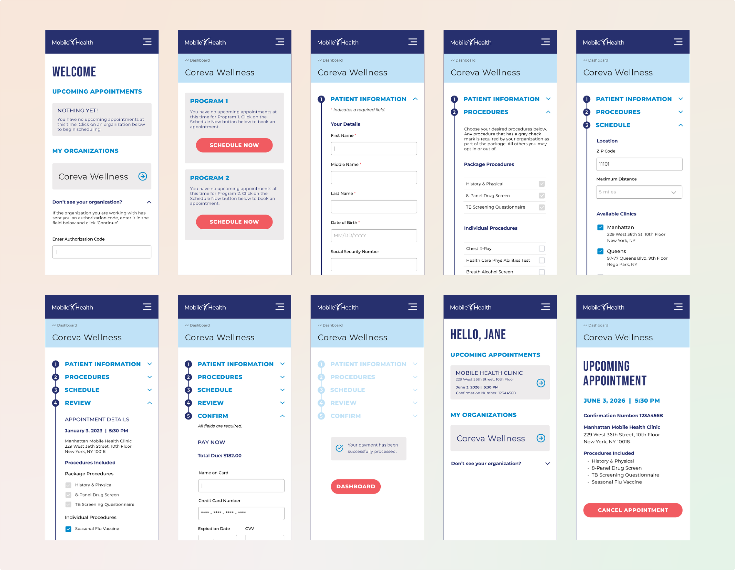
The redesigned portal delivered a cohesive scheduling flow built around clarity and inclusivity — featuring plain-language exam descriptions, accessible iconography, transparent location and availability options, and a confirmation dashboard that gave patients a clear picture of what to expect. Post-launch, clients reported a measurable reduction in scheduling support calls, with patients demonstrating greater confidence navigating the process independently.
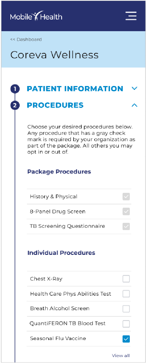
Procedures
Clear exam package and individual procedure options and guidance.
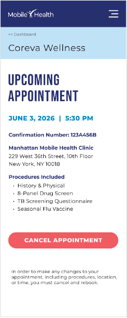
Confirmation
Detailed post-booking confirmation and exam information.
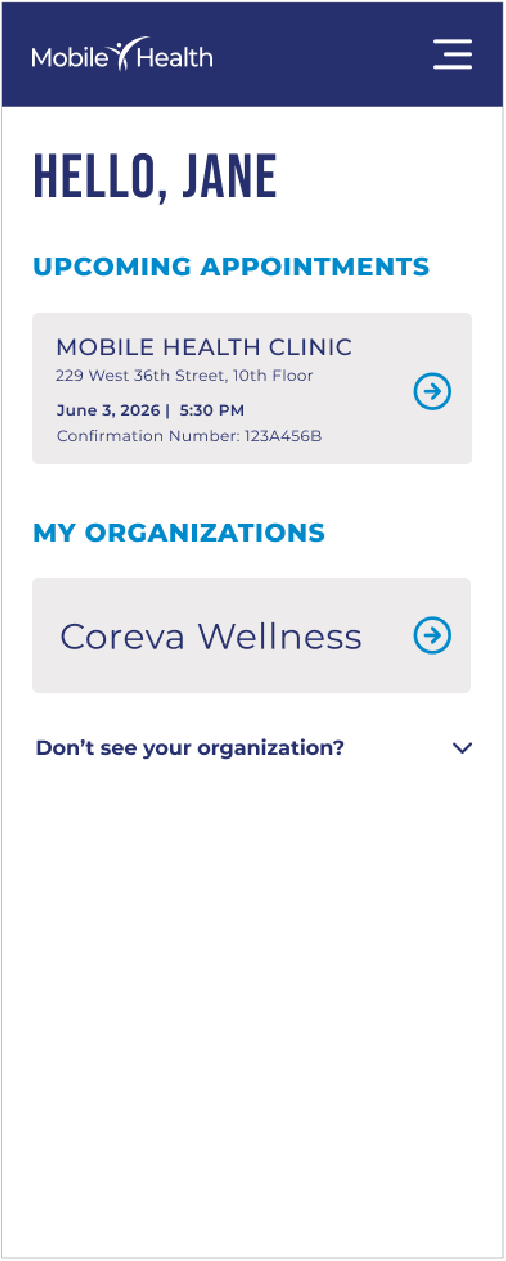
Dashboard
Simplified dashboard with upcoming appointment and organizational information.
Reflection
This project reinforced that accessibility in healthcare UX is not a compliance checkbox — it's the design problem itself. When your users span a large age range, multiple levels of digital literacy, and dozens of first languages, designing for the "average" user means designing for no one. Every decision, from reading level to icon choice to error messaging, had to be questioned through that lens.
It also shaped how I think about advocacy as part of the design role. Getting this project on the roadmap required more than flagging a usability issue — it meant translating UX problems into business impact and making the case in terms that resonated with leadership. That experience changed how I approach project framing, and it's something I’ll carry into future initiatives.